PROJECT OVERVIEW
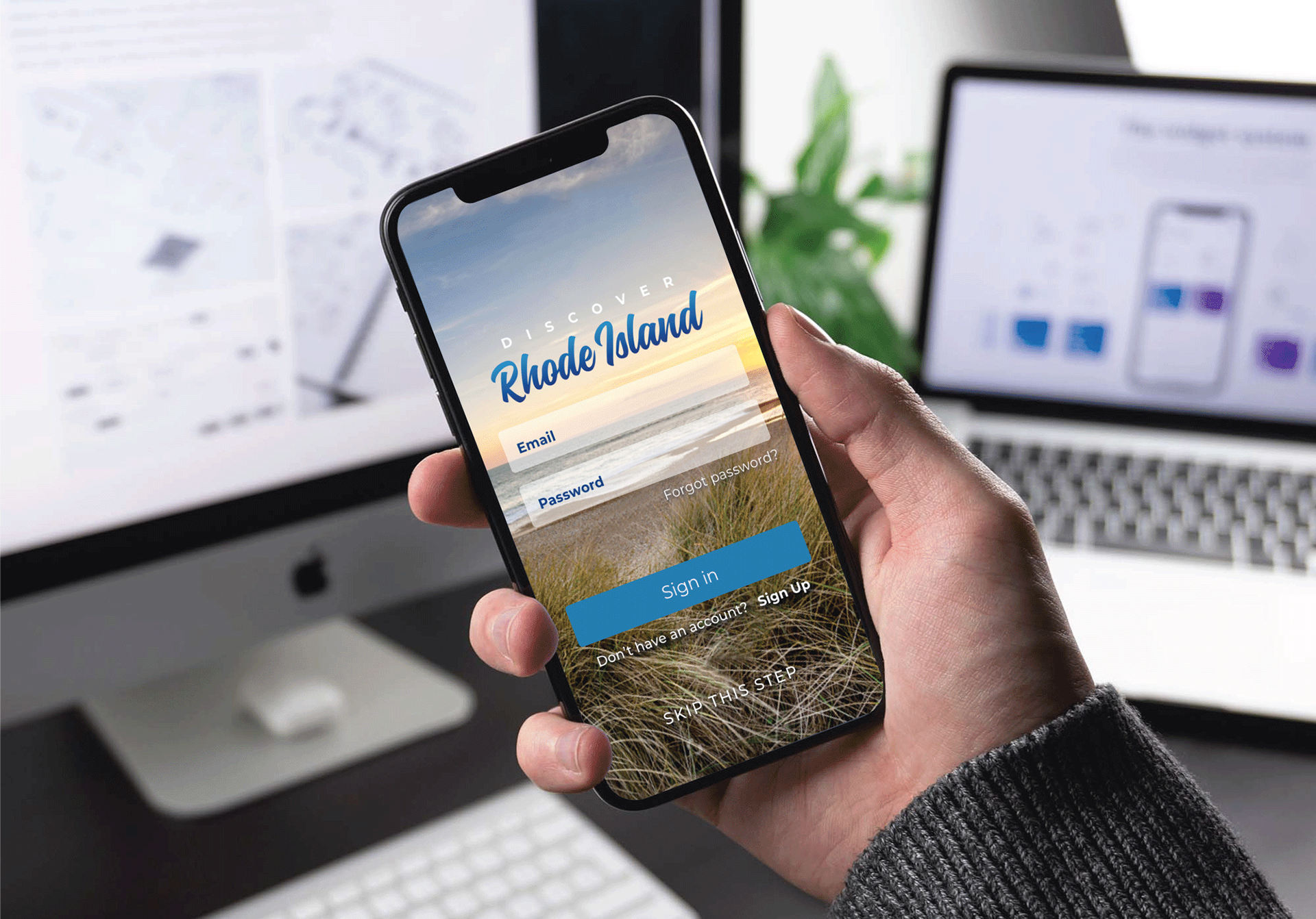
Driven by the notion of having access to a mobile app that would provide users a guide to every place of interest in the state, Discover Rhode Island is the first app designed as a convenient resource for finding what you need, when you need it. Whether visiting for the first time or you happen to be a resident, this app gives users a directory of everything the state has to offer from restaurants and coffee shops, to museums and nightlife.
THE PROBLEM
In order for any app to be successful it must be intuitive, useful, and not deliver any cognitive friction to the user (occurs when a user is confronted with an interface that appears to be intuitive but delivers unexpected results). To ensure this, it's imperative the user flow be immediately obvious to the user and serve up the information in a matter of seconds. If it does not, the frustration could possibly impair the user and jeopardize the user experience.
THE GOALS
As the designer on the project, I felt it was important to first define the 'real-world' goals of the user. What am I looking for? What do I want to know? What information do I need? What would be helpful. Collecting and organizing these objectives was the foundation for defining a user flow that would inform the flow within the app.
DESIGN PROCESS
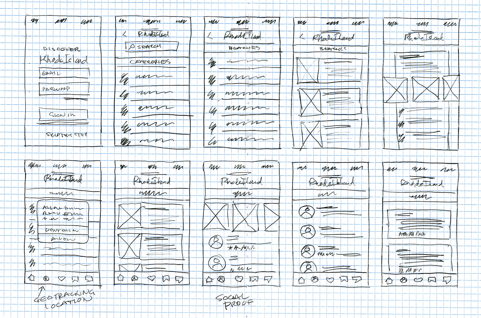
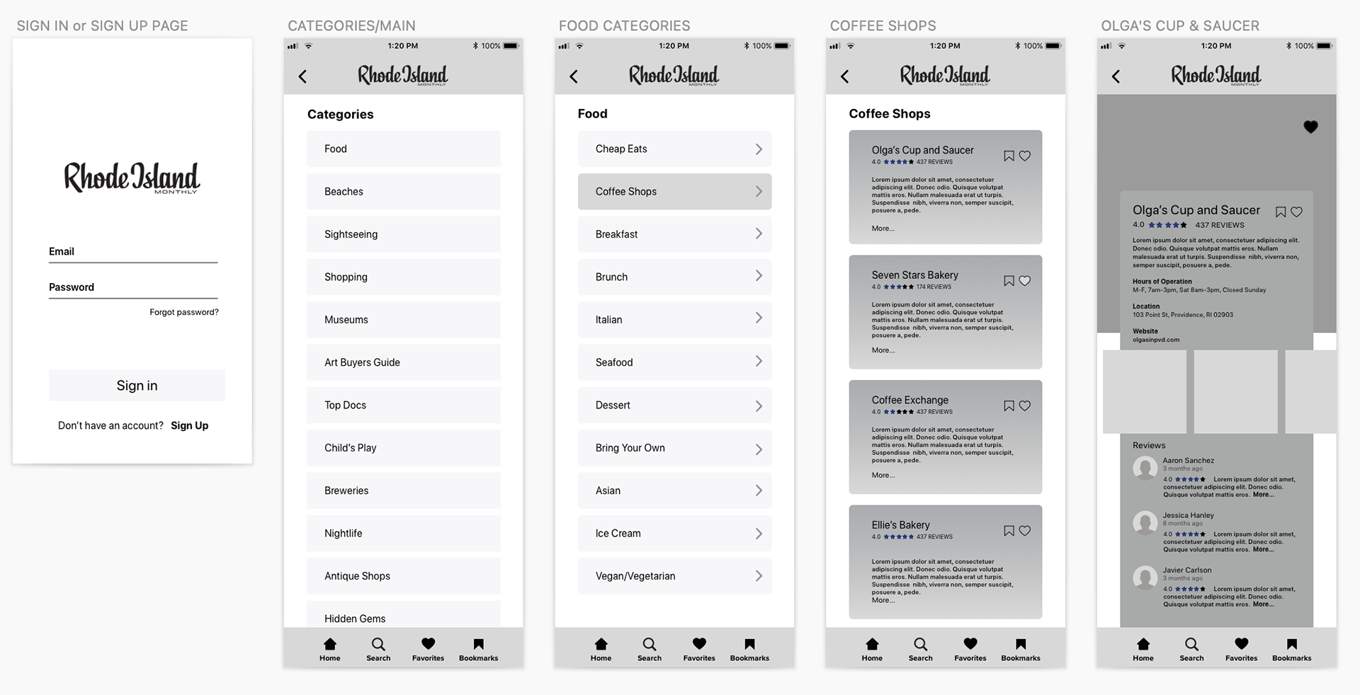
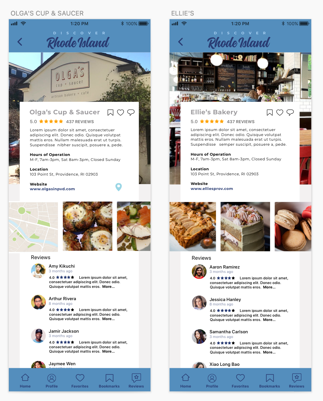
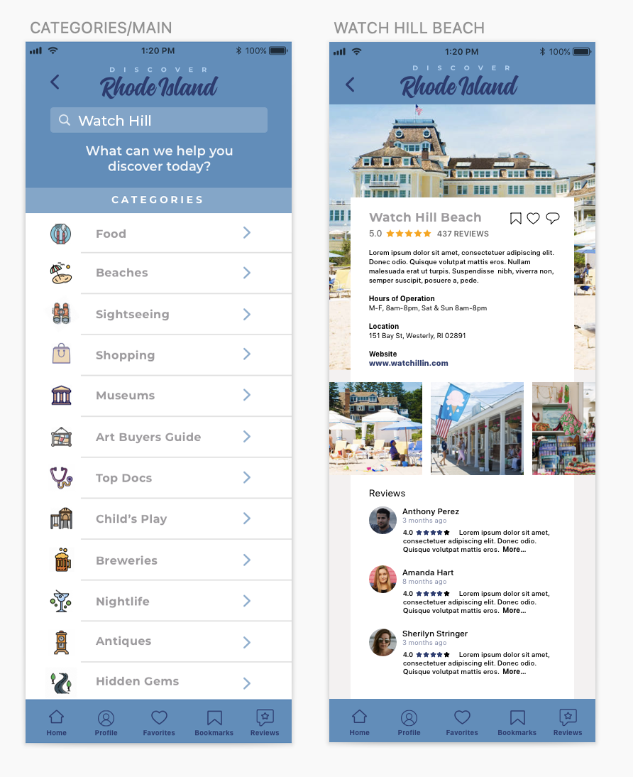
Leveraging the perception that 'beautiful things tend to work better,' I opted to pair each category listing with a simple, yet colorful icon - both to assist the user in quickly identifying the category they were looking for, and make the appearance of each screen a bit more enjoyable. Then, when arriving at the collection of choices I chose to include a small visual with each description to give the user a preview to decide whether they would like to proceed further.
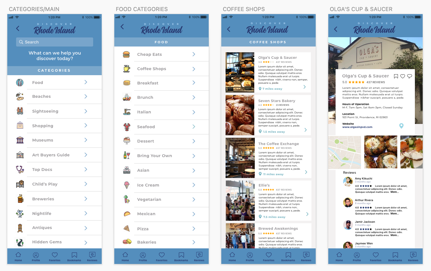
Each 'home screen' or featured destination on the app is an opportunity to provide as much information to the user as possible. It features a brief description, the hours of operation, a link to the website (if available), a brief horizontal scroll of visuals of what you will find there, and reviews. Often the driving factor between 'taking an interest in' and 'taking action' to visit a destination is the nature of the comments within this 'social proof'.
If the user happens to already know the name of the destination they're looking for, I opted to add a search feature to the 'categories screen'. This affordance would allow the user to bypass the drill-down process and go directly to the listing they desire, thereby reducing the number of screens they'd need to enter before accomplishing their task.
Keeping in mind that this app could set a precedent for how the same concept could function for all states, it's important to establish a simple, intuitive, user-friendly flow for the user that could work as easily for other states as well. As this is one of the first of many iterations of this product, extensive user testing would be necessary to refine the app and identify any elements that might not function well for the user.